Release History
v3.0.0 – 03/04/19
What's New
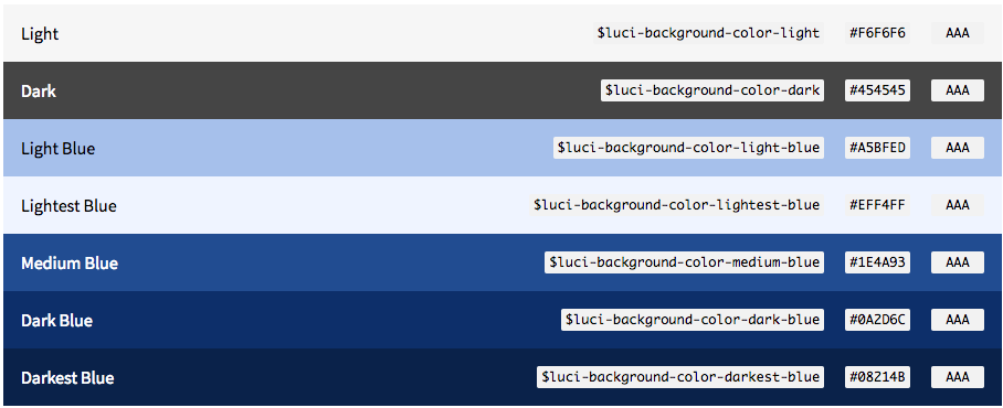
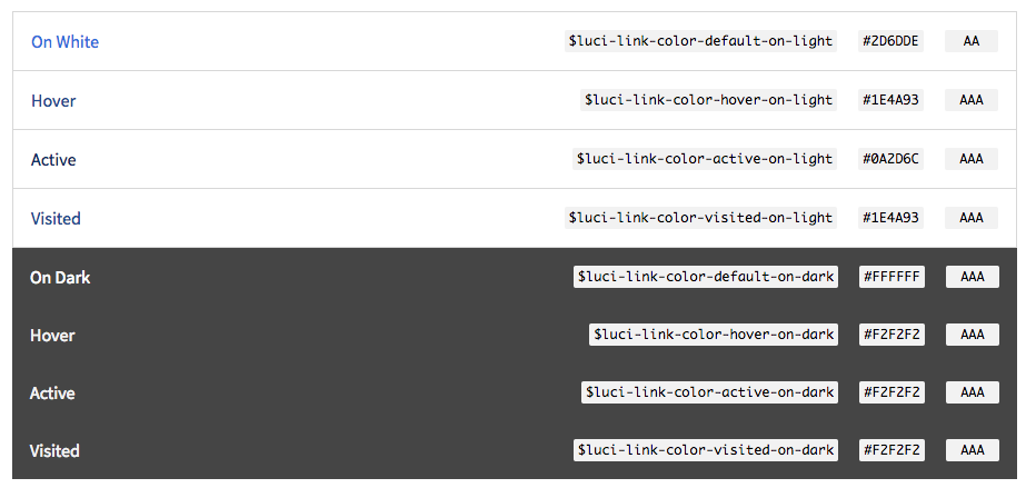
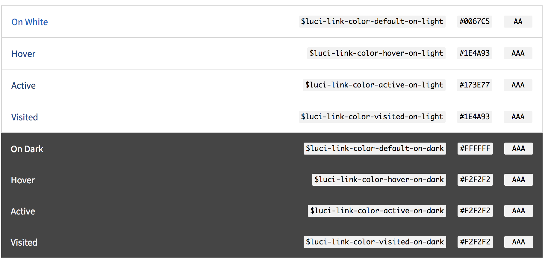
In version 3.0.0 we updated the color palette for backgrounds, selected text, links and interactive colors. We also removed the color palette for accent colors. This change was made to align LUCI with NetApp Brand and to help with visual consistency across products that are using LUCI.
Visual Language
Background secondary colors
Figure: New secondary background colors

Figure: Deprecated secondary background colors

Selected text colors
Figure: New selected state colors

Figure: Deprecated selected state colors

Link colors
Figure: New link colors

Figure: Deprecated link colors

Interactive colors
Figure: New interactive colors

Figure: Deprecated interactive colors

Updated Components
- All components have been updated to match the new color visual language.
v2.6.0 – 11/02/18
What's New
Visual Language
- Favorite Icon – Updated the favorite icon to match the latest Google Material Design Icon style.
- XML Icon - Added XML file icon.
Updated Components
- Popovers – Updated the popover component to provide greater content and formatting flexibility.
New components
v2.5.0 – 8/31/18
What's New
Visual Language
- Accent Colors – Added Do's and Don'ts for accent colors.
- Charts and Graph Colors – Updated color palette for charts and graphs.
- Feedback Colors – Added feedback colors for information notifications.
- Feedback Color Tokens – Added tokens for feedback color.
Updated Components
- Data Table Controls – Table controls are actions that can be applied to one or many selected rows or to the entire table.
- Data Table Row Actions – Row actions include edit, delete, freeze, add attachment, etc.
- Data Table Inline Edit – Rows can be edited inline.
- Data Table Column Search – Searchable columns display a search field below the column header and above the first row of data.
- Data Table Column Actions – Column actions include hide, freeze, etc.
- Notifications – Updated notifications to include a heading and icon, and added an information notification.
New components
v2.4.0 - 7/27/18
What's New
Resources
- SketchApp Sticker Sheet – Update and reorganization of the Sketch sticker sheet to contain a library, which is just an ordinary Sketch document that contains Symbols, Text Styles and Layer Styles
Updated Components
- Data Tables – Enhancements include reorder and resize columns, and nested and expandable rows
- Icon only Button – Updates to the default, hover, focus, and selected states
- Popovers – Deprecating current version of Popovers in preparation for future revisions
New Components
v2.3.0 - 4/27/18
What's New
Visual Language
- Iconography - Added new icons for actions, objects, status and files
- Iconography When to Use - Added guidelines about when to use icons
- Iconography Visual Style - Added instructions on how to create icons based on Google Material Design guidelines
- Tokens for Icons - New token variables to define icon colors
- Tokens for Charts and Graphs - New token variables to define chart and graph colors
- Typography instructions for China - Added instructions on how to workaround China restrictions for Google CDN
Resources
- Upgrade from LUCI 1.0 to LUCI 2.0 - Added instructions on how to upgrade from LUCI 1.0 to LUCI 2.0
- Semantic Versioning - Added documentation about how LUCI uses semantic versioning to inform users of breaking changes, updgrade changes, and bug fix changes
- How to Upgrade - Added instructions on how to upgrade LUCI using npm or compiled assets
Updated Components
- Icon only Button - Fixed hover state and fixed spacing so that the icon only button has equal padding on all sides
- Forms - Added read-only state to form controls
- Buttons Do's and Dont's - Added a recommendation to use title case for button labels
New Components
- Charts and Graphs Visual Language - New visual language defined for charts and graphs to help optimize usability and legibility
- Charts and Graphs Structure - Guidelines to structure chart elements consistently
- Charts and Graphs Line Chart - Guidelines for line charts
- Charts and Graphs Utilization Chart - Guidelines for utilization charts
- Charts and Graphs Implementation - Guidelines for implementing the visual language within a chart and graph library
v2.2.0 - 2/2/18
What's New
Visual Language
- Type Samples - Added responsive typography specifications
- Marketing Font Family - Added who to contact to use the Gotham font family on a marketing-focused website
Resources
- Code Standards
- Updated Design Sticker Sheet (for SketchApp)
- Updated Get Started For Developers Guide that includes a link to download LUCI assets
Updated Components
- Forms - Added a compressed form variation and updated the input style width to 100%
- Buttons - Added an icon only button variation
- Popovers - Added more popover states and updated documentation
New Components
v2.1.0-beta.1 - 12/8/17
What's New
Resources
- Updated Design Sticker Sheet (for SketchApp)
- Updated Get Started For Developers Guide
Components
v2.0.0-alpha.1 - 11/3/17
What's New
Visual Language
- System of visual style, including color, iconography, typography, and spacing
- Tokens for mapping core elements of the visual style
Resources
- Design Sticker Sheet (for SketchApp), Get Started, Contact LUCI
Components
LUCI v1.0
EOL Update
We've made substantial design, code, and architectural improvements with LUCI 2.0. However, if you still need to reference original assets you can do so at the LUCI 1.0 archive.
Upgrade from LUCI 1.0 to LUCI 2.0
LUCI 2.0 uses a different namespace for class names, which is more aptly name .luciinstead of .n.
The change in class names allows us to remove any dependency from LUCI 1.0 and not introduce regression as we update and maintain LUCI 2.0. In theory, your team could support both versions as a result. For example, if you wanted to use the LUCI 2.0 button styles and use the property bar available in LUCI 1.0, you can update your buttons with the class name .luci-button .luci-button--primary.
Semantic Versioning
Each update to LUCI follows the Semantic Versioning process, which is a set of rules and requirements that dictate how version numbers are assigned and incremented based on a major, minor, or patch to the LUCI project.
Patch version Z (x.y.Z | x > 0) is incremented when backwards compatible bug fixes are introduced. A bug fix is defined as an internal change that fixes incorrect behavior.
Minor version Y (x.Y.z | x > 0) is incremented if new, backwards compatible functionality is introduced. It is also incremented if any functionality is marked as deprecated.
Major version X (X.y.z | X > 0) is incremented if any backwards incompatible changes are introduced.
How to Upgrade
If using NPM (recommended), run: npm update @netapp/luci --save from the root of your project.
If using compiled assets: download the latest zip files.