Dialogs
Dialogs inform users about a task, process, or necessary decision. They contain text and UI controls and overlay on top of the primary application window.
Dialogs retain focus until they are dismissed or a required action is taken. LUCI recommends using dialogs sparingly, as they interrupt a user’s interaction.
Modal Versus Non-Modal Dialogs
There are two types of dialogs: modal and non-modal. The primary difference between the two dialogs is that a modal dialog obscures the originating page and requires a distinct action from the user in order to proceed or close it, whereas a non-modal dialog is an overlay that requests a response from the user but does not disable the originating page and can be ignored or easily dismissed.
Modal Dialogs
A modal dialog overlays the main window and creates a “mode” that disables that main window but keeps it partially visible as a child window in front. Users must interact directly with the modal dialog before they can return to the main application window.
Basic Modal Dialog
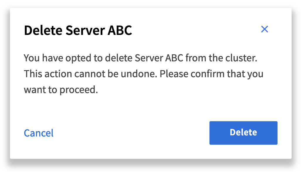
At minimum, modal dialogs include a title, text and associated actions (often 2-3).

<button class="luci-button luci-button--primary" data-luci-toggle="modal" data-luci-target="#basicModalLarge"> Launch Demo Modal </button>
<dialog class="luci-dialog" id="basicModalLarge" aria-modal="true" aria-hidden="true" role="dialog">
    <div class="luci-dialog__content">
        <div class="luci-dialog__header">
            <h4 class="luci-dialog__title">Delete Server ABC</h4>
            <button class="luci-button luci-button--icon-only luci-button--flat" data-luci-dismiss="modal">
                <span class="luci-button__inner">
                    <svg class="luci-icon luci-button__icon luci-button__icon--left" aria-hidden="true">
                        <use xlink:href="/icons/luci.svg#close">
                        </use>
                    </svg>
                </span>
            </button>
        </div>
        <div class="luci-dialog__body">
            <p class="luci-dialog__text">You have opted to delete Server ABC from the cluster. This action cannot be undone. Please confirm that you want to proceed.</p>
        </div>
        <div class="luci-dialog__footer">
            <a class="luci-link" href="#" data-luci-dismiss="modal"> Cancel </a>
            <button class="luci-button luci-button--primary"> Delete </button>
        </div>
    </div>
</dialog>
Modal dialogs are dismissed either by clicking the "close" icon placed in the upper right, or the click of an associated action button or link. Modals should always include a close icon and an explicit cancel action. Both should behave the same way, closing the dialog and returning the user to the primary window.
Modal Dialog Form
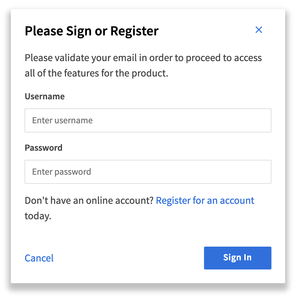
Modal dialogs can contain form elements. They are often used when there’s a need to collect information from the user in order to proceed on a task such as sign-in.

<button class="luci-button luci-button--primary" data-luci-toggle="modal" data-luci-target="#modalDialogFormLarge"> Launch Demo Modal </button>
<dialog class="luci-dialog" id="modalDialogFormLarge" aria-modal="true" aria-hidden="true" role="dialog">
    <div class="luci-dialog__content">
        <div class="luci-dialog__header">
            <h4 class="luci-dialog__title">Please Sign or Register</h4>
            <button class="luci-button luci-button--icon-only luci-button--flat" data-luci-dismiss="modal">
                <span class="luci-button__inner">
                    <svg class="luci-icon luci-button__icon luci-button__icon--left" aria-hidden="true">
                        <use xlink:href="/icons/luci.svg#close">
                        </use>
                    </svg>
                </span>
            </button>
        </div>
        <div class="luci-dialog__body">
            <p class="luci-dialog__text">Please validate your email in order to proceed to access all of the features for the product.</p>
            <form class="luci-form luci-form--compressed" action="#" method="post">
                <div class="luci-form__field-group">
                    <label for="username" class="luci-form__label">Username</label>
                    <input type="text" name="username" id="luci-input-54009" class="luci-form__input" placeholder="Enter username" aria-describedby="Username">
                </div>
                <div class="luci-form__field-group">
                    <label for="password" class="luci-form__label">Password</label>
                    <input type="password" name="password" id="luci-input-20573" class="luci-form__input" placeholder="Enter password" aria-describedby="password">
                </div>
            </form>
            <p class="luci-dialog__text">Don't have an online account? <a href="#" class="luci-link">Register for an account</a> today.</p>
        </div>
        <div class="luci-dialog__footer">
            <a class="luci-link" href="#" data-luci-dismiss="modal"> Cancel </a>
            <button class="luci-button luci-button--primary"> Sign In </button>
        </div>
    </div>
</dialog>
Do's and Don'ts
Modal dialogs allow the user to enter information critical to continuing the current process. Use modal dialogs to display important warnings as a way to prevent or correct critical errors.
Do
- Always include a title, content and associated actions.
- Keep the actions to a minimum (2 to 3 max).
- Keep the content succinct and brief.
- Include a close icon and an explicit cancel or dismiss button/link to remove the modal dialog.
Don’t
- Do not use modals to show error, success or warning messages. Instead, place those on the page using notification components.
- Do not use modal dialogs for complex decision making that requires additional sources of information unavailable in the modal.
- Do not use modal dialogs for nonessential information that is not related to the current flow.
- Do not open a modal dialog without the user having done anything.
- Do not open a modal dialog inside of a modal window.
Non-modal Dialogs
Like a modal dialog, a non-modal dialog window sits on top of a main window. The main difference is that it does not disable the underlying window when it appears. The user can still interact with the page while the non-modal dialog window is open.
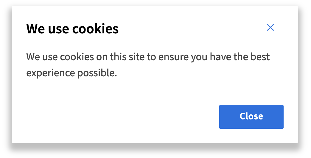
Non-modal dialogs are most often used for simple messaging and non-critical interactions as illustrated in the following examples:
Basic non-modal dialog examples

<button class="luci-button luci-button--primary" data-luci-toggle="modal" data-luci-target="#nonModalDialogLarge"> Launch Demo Modal </button>
<dialog class="luci-dialog luci-dialog--non-modal" id="nonModalDialogLarge" aria-modal="true" aria-hidden="true" role="dialog">
    <div class="luci-dialog__content">
        <div class="luci-dialog__header">
            <h4 class="luci-dialog__title">We use cookies</h4>
            <button class="luci-button luci-button--icon-only luci-button--flat" data-luci-dismiss="modal">
                <span class="luci-button__inner">
                    <svg class="luci-icon luci-button__icon luci-button__icon--left" aria-hidden="true">
                        <use xlink:href="/icons/luci.svg#close">
                        </use>
                    </svg>
                </span>
            </button>
        </div>
        <div class="luci-dialog__body">
            <p class="luci-dialog__text">We use cookies on this site to ensure you have the best experience possible.</p>
        </div>
        <div class="luci-dialog__footer">
            <button class="luci-button luci-button--primary" data-luci-dismiss="modal"> Close </button>
        </div>
    </div>
</dialog>
Do's and Don'ts
Do
- Use non-modal dialogs when the user needs to interact with the original page while the overlay is open.
- Use non-modal dialogs for short, simple and non-critical information.
- Use non-modal dialogs for providing quick access to additional options or controls.
Don’t
- Do not use non-modal dialogs for extensive or lengthy content. Dialogs should only be used for short messages.
Accessibility
- Include an
aria-modal="true"attribute on the dialog element. - Include an
aria-hidden="true"attribute on the dialog element that toggles toaria-hidden="false"when the dialog is open.
Class Reference
| Class | Applies to | Outcome |
|---|---|---|
|
|
|
Sets the max-width of the dialog window to 320px. |
|
|
|
Enables the draggability of the modal, changes the cursor to move, and removes the transparent backdrop. |
|
|
|
Changes the cursor to grabbing. |