Get Started
The LUCI design system includes a foundation of assets and resources to help teams design and build cohesive NetApp websites and digital products.
Follow these guidelines to begin using the system.
Overview
We recommend the following steps to start developing with LUCI:
- Get an overview of our coding standards, including the class naming conventions used in our CSS.
- Review the components for semantically correct and accessible markup and documentation.
- Follow the development-environment—specific getting-started steps below.
General Installation Instructions
The LUCI zip file contains the compiled CSS and SVG sprite for the icons. Once you have downloaded it, you can link to the CSS from your index.html page and use SVG icons in your components.
<!DOCTYPE html>
<html>
  <head>
    <meta charset="utf-8">
    <title>LUCI Demo</title>
    <link rel="stylesheet" href="/styles/luci.css">
    <!-- Include this script to use SVG Sprite in IE -->
    <script src="/your/path/to/svg4everybody.min.js" charset="utf-8"></script>
    <script type="text/javascript">
      svg4everybody();
    </script>
  </head>
  <body>
    <h1>Welcome to LUCI</h1>
  </body>
</html>
Setting up LUCI With npm
The following steps will prepare you to work with LUCI in a local Node.js development environment.
We will assume you have knowledge of the following:
Initialize your project.
a. Once you've dowloaded and installed the prerequisites for your node environment, create a folder for your project.
  $ mkdir luci-demo
  $ cd luci-demo
b. Inside your
luci-demo, folder create a package.json file with defaults set.$ npm init --yes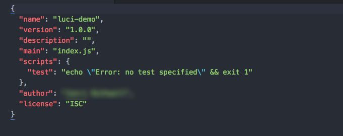 Figure: Example package.json file
Install the following npm packages as dependencies:
a. LUCI
$ npm install --save @netapp/lucib. Browsersync will allow you to run a local server and see your changes in your favorite web browser.
$ npm install --save-dev browsersync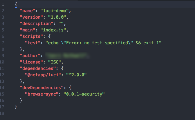 Figure: Updated package.json file
Add LUCI to your project by linking to the compiled LUCI stylesheet in your
index.htmlfile.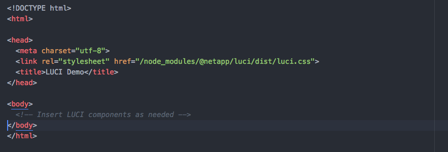 Figure: Index file with link to LUCI stylesheet
Copy and paste the basic form code example into your
index.htmlfile.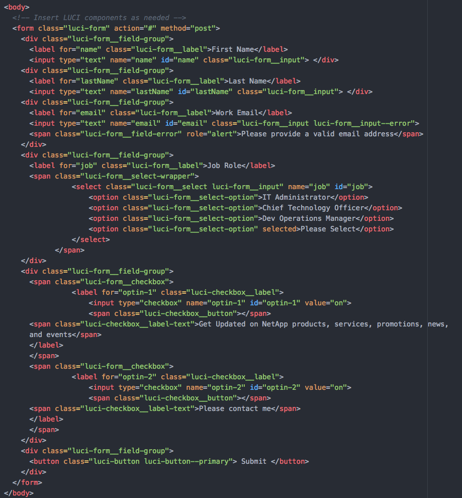 Figure: Index file with LUCI form
Execute the following command to start a local web server:
$ browser-sync start --server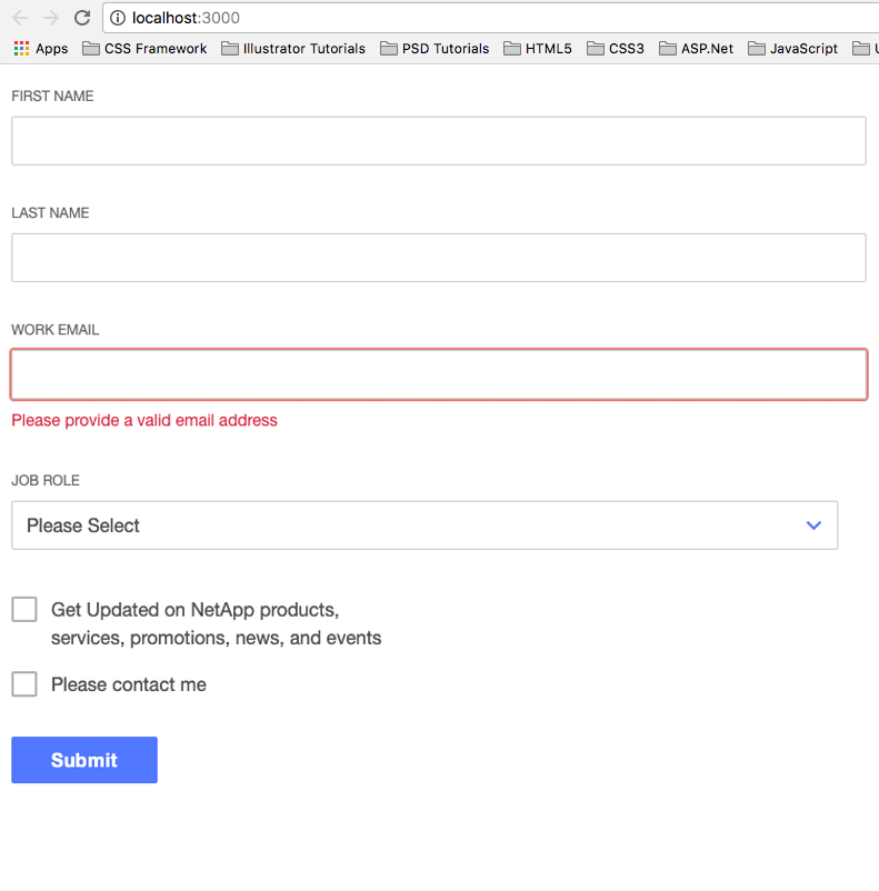 Figure: LUCI web page with basic form
Setting up LUCI With Sass
In order to take advantage of some of the LUCI Sass features such as tokens and mixins, you will need to set up your project to use Sass. Because Sass is a preprocessor for CSS, you will need to install additional tools to compile Sass to CSS.
We recommend the following:
We will assume you completed the steps to set up LUCI with npm.
npm install Gulp and gulp-sass.
$ npm install --save-dev gulp gulp-sass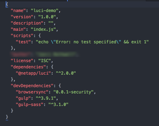 Figure: Updated package.json
Create a
gulpfile.jsfile in the root folder of your project and copy and paste the following code:const gulp = require('gulp'); const sass = require('gulp-sass'); gulp.task('sass', function() { return gulp.src('./styles/*.scss') .pipe(sass()) .pipe(gulp.dest('./dist/css')); });Create a scss stylesheet.
a. In the
luci-demoproject, create a new styles folder.b. In the styles folder, create a
master.scssfile, for example.c. Import the LUCI token and typography partials at the top of your
master.scssfile. Figure: Imported LUCI partials
Reset the body text to match LUCI styles.
 Figure: Font reset example
Add an
h1to your stylesheet and use the LUCI mixin to style theh1.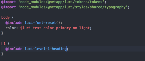 Figure: Heading mixin
Update your index.html file to the following:
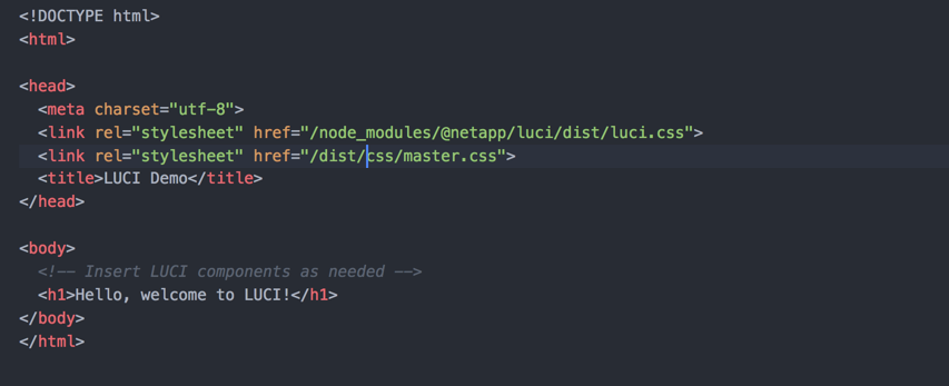 Figure: Updated index.html
Compile your stylesheet and view your changes in the browser.
$ gulp sass $ browser-sync start --server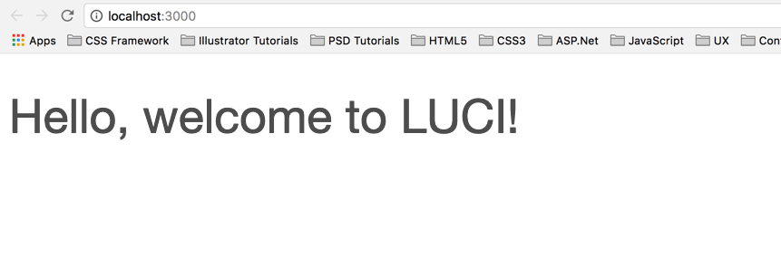 Figure: Hello LUCI page
Review How to design with tokens for additional information about how to use tokens with existing HTML.
Using LUCI with Angular
Installing LUCI
Run:
npm install @netapp/luci --save
to install LUCI in your Angular app.
Add LUCI styles
LUCI component styles are available as scss or css and can be added to your Angular app using either method. If you intend to use LUCI's components in your app, it's best to include the entire LUCI library.
If you're not using LUCI components in your application but do want to use LUCI's design tokens to style your application you can install tokens only via scss.
Install via scss
In your Angular app, add the following:
@import '~@netapp/luci/styles/luci';This import will give you access to component styles AND all LUCI tokens.
To install scss tokens only
In your Angular app, add the following:
@import '~@netapp/luci/tokens/tokensRefer to the Styling With Tokens guide for more information on using Design Tokens.
Install css
In your Angular app, add the following:
@import '~@netapp/luci/dist/luci.css';Include LUCI icons
LUCI's icons are available as an SVG sprite within the LUCI npm package. To include the LUCI icon sprite in your Angular project, add it to the "assets" key in your angular.json config file:
{
  "$schema": "./node_modules/@angular/cli/lib/config/schema.json",
  "version": 1,
  "newProjectRoot": "projects",
  "projects": {
    "luci-angular-test-css": {
      "root": "",
      "sourceRoot": "src",
      "projectType": "application",
      "prefix": "app",
      "schematics": {},
      "architect": {
        "build": {
          "builder": "@angular-devkit/build-angular:browser",
          "options": {
            "outputPath": "dist/luci-angular-test-css",
            "index": "src/index.html",
            "main": "src/main.ts",
            "polyfills": "src/polyfills.ts",
            "tsConfig": "src/tsconfig.app.json",
            "assets": [
              "src/favicon.ico",
              "src/assets",
              { "glob": "**/*.svg", "input" : "./node_modules/@netapp/luci/dist", "output": "/assets/" }
            ],
            "styles": [
              "src/styles.css"
            ],
            "scripts": [],
            "es5BrowserSupport": true
          },
        ...
          "test": {
          "builder": "@angular-devkit/build-angular:karma",
          "options": {
            "main": "src/test.ts",
            "polyfills": "src/polyfills.ts",
            "tsConfig": "src/tsconfig.spec.json",
            "karmaConfig": "src/karma.conf.js",
            "styles": [
              "src/styles.css"
            ],
            "scripts": [],
            "assets": [
              "src/favicon.ico",
              "src/assets",
              { "glob": "**/*.svg", "input" : "./node_modules/@netapp/luci/dist", "output": "/assets/" }
            ]
          }
         ...
Be sure to add the reference under both the "build" and "test" configurations in the angular.json file:
projects.your-project-name.architect.build.options.assetsprojects.your-project-name.architect.test.options.assets
Use LUCI markup within your app
Find a component on http://luci.netapp.com that you want to use within your app and click the "Copy Code" button.

Paste the component into your Angular app.
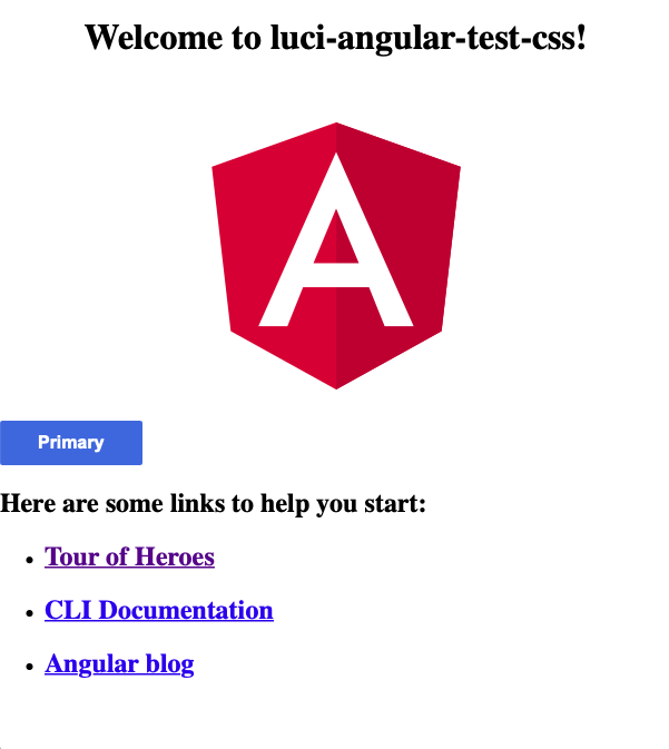
In this example some LUCI Button markup has been copied into the default app template
<!--The content below is only a placeholder and can be replaced.-->
<div style="text-align:center">
  <h1>
    Welcome to {{ title }}!
  </h1>
  <img width="300" alt="Angular Logo" src="svg-source">
</div>
<button class="luci-button luci-button--primary"> Primary </button>
<h2>Here are some links to help you start: </h2>
<ul>
  <li>
    <h2><a target="_blank" rel="noopener" href="https://angular.io/tutorial">Tour of Heroes</a></h2>
  </li>
  <li>
    <h2><a target="_blank" rel="noopener" href="https://angular.io/cli">CLI Documentation</a></h2>
  </li>
  <li>
    <h2><a target="_blank" rel="noopener" href="https://blog.angular.io/">Angular blog</a></h2>
  </li>
</ul>
You now have access to all of LUCI's styles and can weave LUCI markup into your Angular app as you see fit.
Follow Accessibility Guidelines
When using component markup in your Angular application, be sure to reference the "Accessibility" section of the component documentation on luci.netapp.com. For example: LUCI Button Accessibility Guidelines
The Accessibility Guidelines sections have been authored for each component, where relevant, and ensure we're providing the best experience for all NetApp product users.
Creating Angular Components
Angular provides a convenient means for reusing units of visual style and functionality via Angular components. These align nicely with LUCI's definition of components and LUCI's components can be ported into Angular's component model.
This portion of the guide will start with the LUCI Button component and create an Angular component called <luci-button> that can be used within the angular app.
Generate an Angular component
In your Angular app run:
ng generate component luci-button --inline-template --inline-style
This will generate two new files:
src/app/luci-button/luci-button.component.spec.ts- a test file, leave alone for nowsrc/app/luci-button/luci-button.component.ts- a file for the button component itself
Modify the selector in the component definition to be simply luci-button and update the template with Button HTML copied and pasted from the LUCI site:
import { Component, OnInit } from '@angular/core';

@Component({
  selector: 'luci-button',
  template: `
    <button class="luci-button luci-button--primary"> Primary </button>
  `,
  styles: []
})
export class LuciButtonComponent implements OnInit {

  constructor() { }

  ngOnInit() {
  }
}
Next, call the newly created component in your app using the <luci-button> element.
<div style="text-align:center">
  <h1>
    Testing LUCI in Angular
  </h1>
  <luci-button></luci-button>
</div>
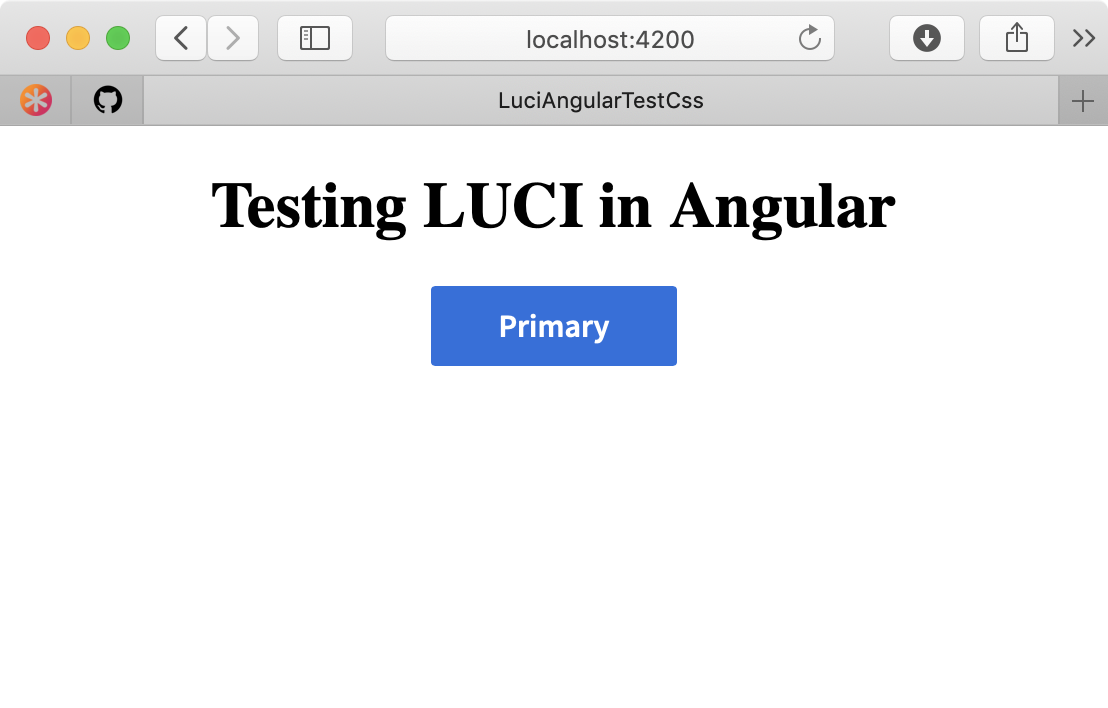
You should see the LUCI button component rendered when you start your Angular app locally:
Adding flexibility with Input props
In order to make the <luci-button> component more useful, add Input props to control various aspects of the button.
Add a "text" Input prop that will allow button text to be changed dynamically when calling instances of <luci-button>.
import { Component, OnInit, Input } from '@angular/core';

@Component({
  selector: 'luci-button',
  template: `
    <button class="luci-button luci-button--primary">{{ text }}</button>
  `,
  styles: []
})
export class LuciButtonComponent implements OnInit {
  @Input() text: string;

  constructor() { }

  ngOnInit() {
  }

}
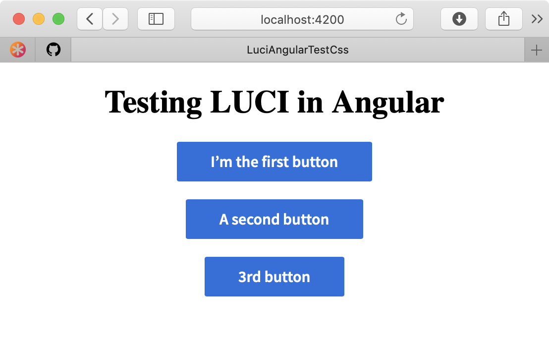
Next, call multiple instances of <luci-button> within your app, using the text attribute to change the Button's test.
<div style="text-align:center">
<h1>
Testing LUCI in Angular
</h1>
<luci-button text="I'm the first button"></luci-button>
<br>
<br>
<luci-button text="A second button"></luci-button>
<br>
<br>
<luci-button text="3rd button"></luci-button>
</div>Instances of <luci-button> can now have their text set programatically.
Adding Additional Props
Extend this concept further by adding Input props for size and variant. Refer to Button's class reference docs for all the possible button variations and the corresponding CSS classes required to enable them.
Update the button component
import { Component, OnInit, Input } from '@angular/core';

@Component({
  selector: 'luci-button',
  template: `
    <button class="luci-button luci-button--{{ variant }} {{ sizeClass }}"></button>
  `,
  styles: []
})
export class LuciButtonComponent implements OnInit {
  @Input() size: string;
  @Input() text: string;
  @Input() variant: string = 'primary';


  constructor() { }

  ngOnInit() {
    if (this.size) {
      this.sizeClass = `luci-button--${this.size}`;
    }
  }
}
Next, update the component calls in the application.
<div style="text-align:center">
  <h1>
    Testing LUCI in Angular
  </h1>
  <luci-button text="Primary"></luci-button>
  <br>
  <br>
  <luci-button text="Small secondary button" variant="secondary" size="small"></luci-button>
  <br>
  <br>
  <luci-button text="Flat Button" variant="flat"></luci-button>
</div>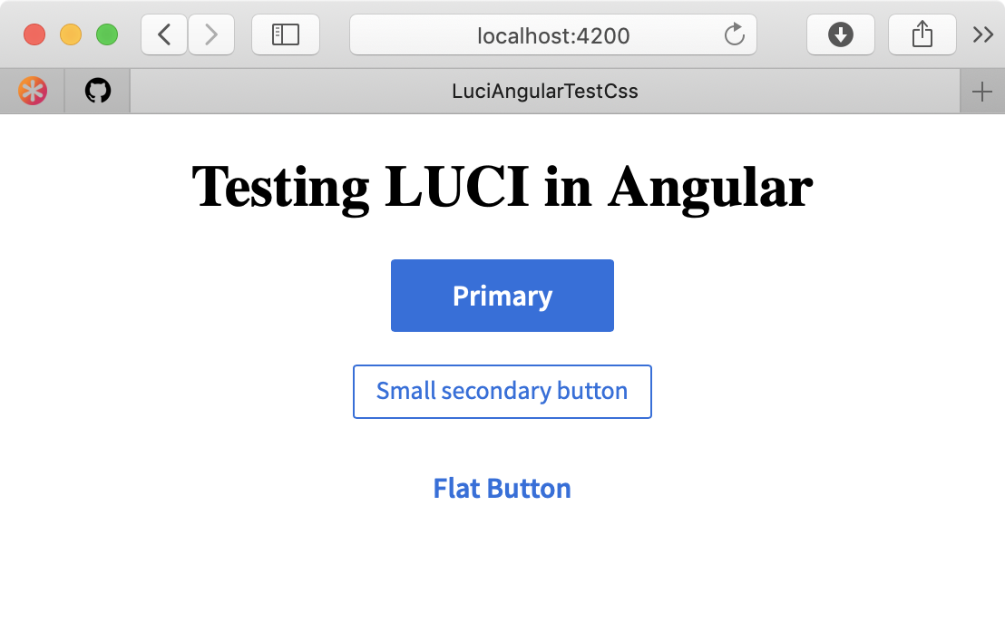
Continue adding Input props and additional functionality to map the LUCI CSS API for Button to the Angular component. Always include accessibility requirements for each component when mapping LUCI's documentation to Angular.